Intersection Crash Analysis with QGIS
How to perform four different methods of intersection crash analysis. Compares how and why the results differ.
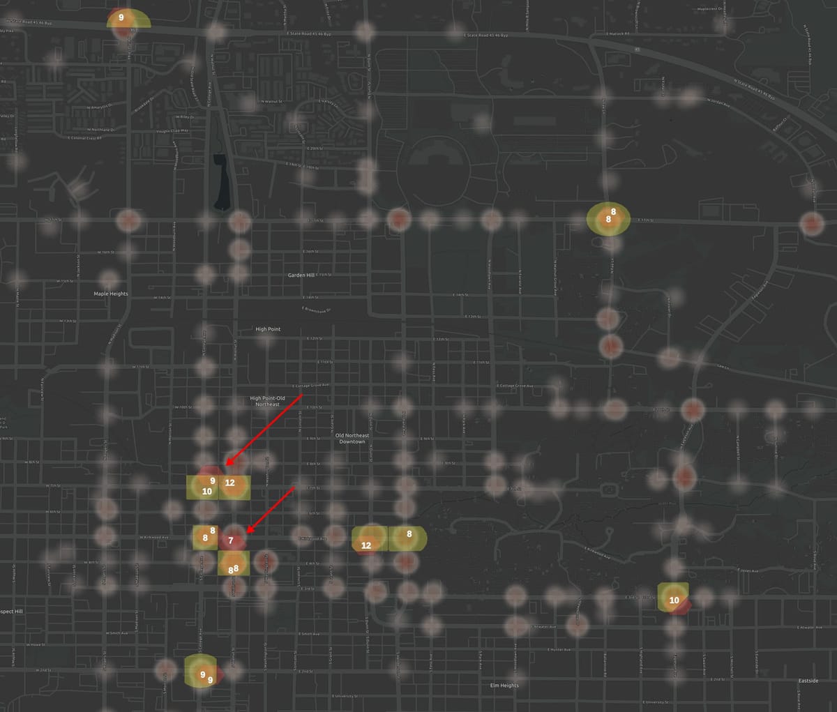
The highest crash locations for cities are often intersections. Here's a tour of different methods to find the high-crash intersections in a city and how those methods compare and contrast.
Generating a crash heatmap visualization with QQIS
A heatmap can visually show you where crashes are across a city. This method doesn't quantify the highest crash locations, but may be a useful visualization to see trends across the street network, or a background layer for analysis of the most crash-prone intersections. QGIS, a free and open source app, makes this extremely easy. Use "Layers > Add Layer > Add Vector Layer" to load your crash data layer. If needed, filter to the layer to a particular kind of crash (Right click on layer > Filter). Double-click the layer to bring up the Properties panel and select "Symbology > Heatmap".
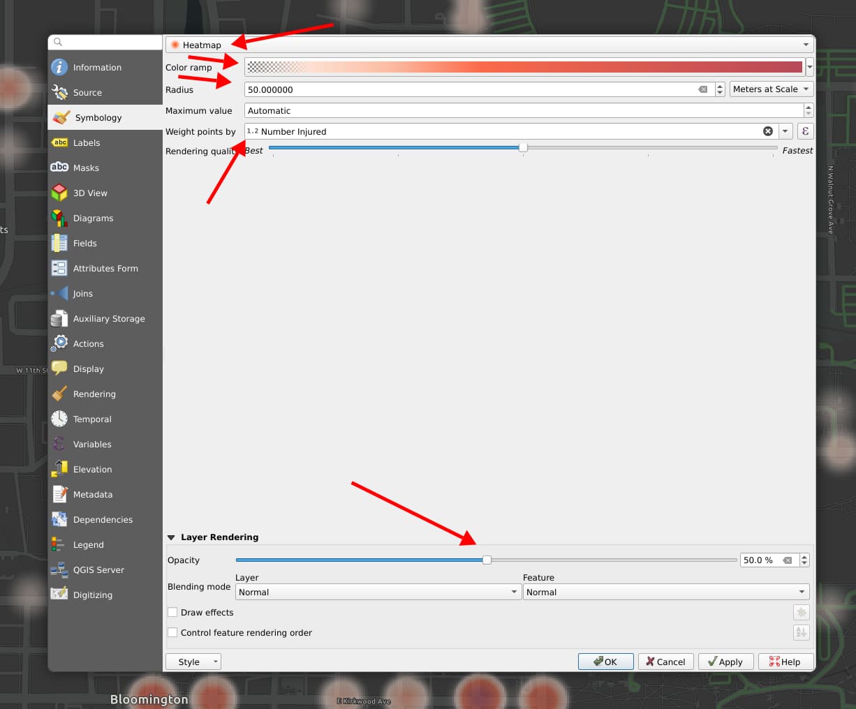
To explain the arrows I've added to the screenshot:
- To display the heatmap over background, use a color ramp that starts out transparent and adjust the overall layer opacity as well.
- Experiment with the radius. If don't you see the "Meters" option, you may need to re-project the layer to a local CRS. (Right-click layer > Export > Select local CRS).
- By default the heatmap will consider one point for each crash. If your crash data has field like "number injured". you might wish to weight your visualization based on that.
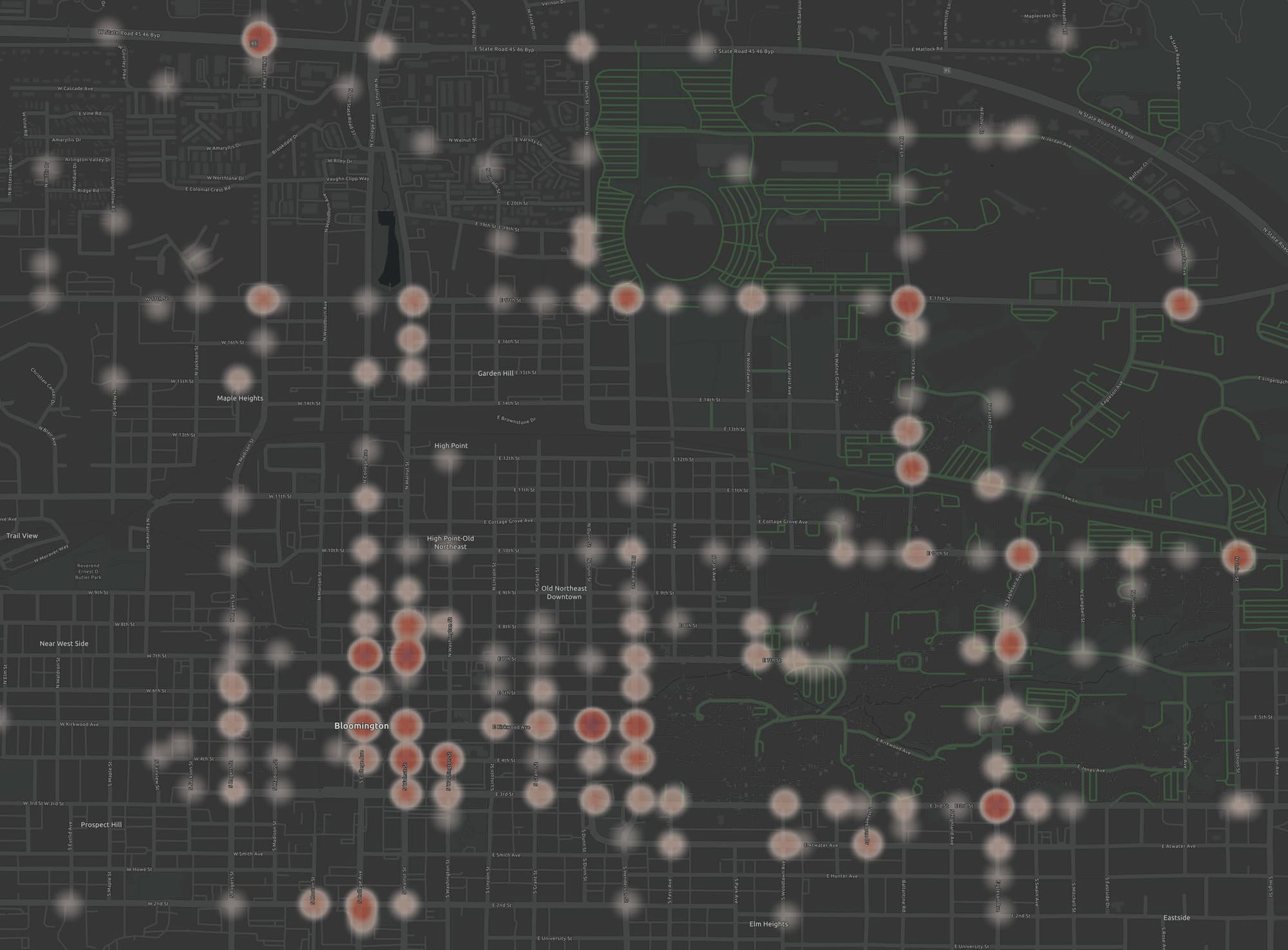
This visualization doesn't provide the number of crashes for each intersection, but it does quickly visualize the highest-crash intersection as well as the illustrating that some corridors are more crash prone as well.
Next we'll look at methods to quantify the high crash locations and find the the top locations for each method.
Four methods of intersection crash analysis
Radius method: count crashes within 250 feet of an an intersection. While this method is used in studies and sounds like exactly what you'd want, it double-counts crashes when intersections are close together.
Hex method: count crashes within each cell of a hex-grid. This method avoids double counting, and finds the highest crash locations across a city whether they are at an intersection or not. However, where the edges of a hex grid lands are essentially random, potentially dividing a high number of crashes at an intersection between two different hex cells.
Closest-intersection method: count crashes within a Voronoi polygon of each intersection. This method assigns every crash to the closest intersection, so every crash is counted and counted exactly once. But where intersections are sparse, crashes may be grouped with an intersection that is not very close by.
Radius-Voroni method: count crashes within a radius of an intersection, using Voronoi polygons to attribute each crash to the closest intersection. By using an extra step, it captures useful aspects of both the radius and closest-intersection methods.
So which method to choose? The good news is that all can be run in a just a few minutes at city-scale. So you can run more than method and compare the results.
I'll run them all below for pedestrian crashes in Bloomington, Indiana so you can see how the results compare in practice.
I'll be using QGIS and assume some basic familiarity with it.
For larger cities or more advanced needs, you may want to do a high-injury corridor analysis using sliding windows or a Getis-Ord analysis.
Crash analysis using a hex grid
This method doesn't require a point layer for all intersections.
To create a hex grid, start by putting your city within view. If you are new to QGIS, you may need to add a base map first to see a map in the background.
There are some other grid types to choose from, but hexagons are preferable for street network analysis because they are more likely intersect street works and not accidentally align with north-south / east-west street networks.
Create the grid
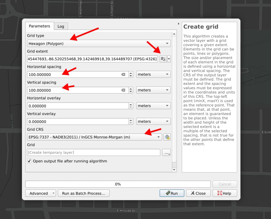
Use "Processing > Toolbox" to bring up the "Create Grid" tool.
First you'll need to set the Grid CRS– the projection– to a local projection so that you an set the grid size in meters. There's a little globe icon to find a projection that's local to your project.
Once your CRS is selected, you can set the horizontal and vertical size of the grid. Here I used 100 meters. The idea here is that each hex grid cell should capture about one crash prone intersection.
Add the crash data
Next, you'll add to add your crash data as a layer. Most formats can be added using "Layer > Add Layer > Add Vector Layer".
Maybe filter the data
Your crash dataset might have included all kinds of crashes, and maybe you only want to look at one kind of crash, like pedestrian-involved crashes. You can right-click on the crash layer and select the "Filter..." option. Embark on a side quest to learn about filtering in QGIS if needed.
Count the crashes in each hex cell
In "Processing > Toolbox", find the "Count points in polygon tool". With it, you can select the layer of crash points you might have filtered as the layer of hex cells, and run the tool. It will add an attribute to each hex cell with the count of crashes in the cell.
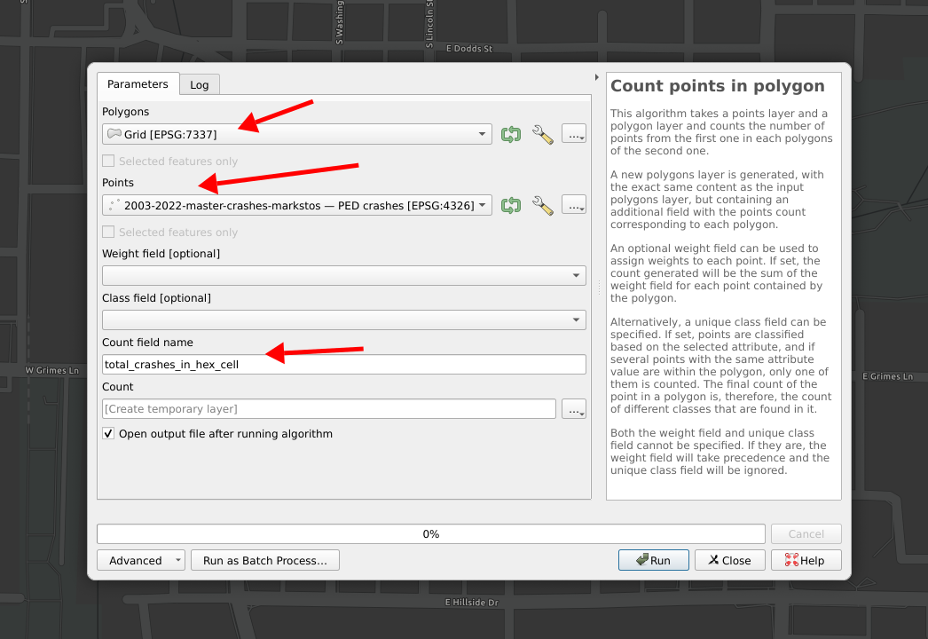
Almost done! To visualize the top crash intersections, you need to filter the results to the top intersections and then style their presentation.
The filtering can be done through "Layer > Add Layer > Add/Edit Virtual Layer" and then using SQL to filter to the cells with the 10 highest crash values, like this:
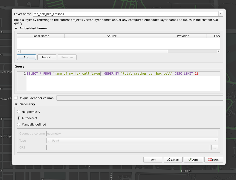
Now, this will return precisely 10 results whether or not there are any ties. You may wish to first limit to 12 or 15 results to see if were any other hexes right on the cusp.
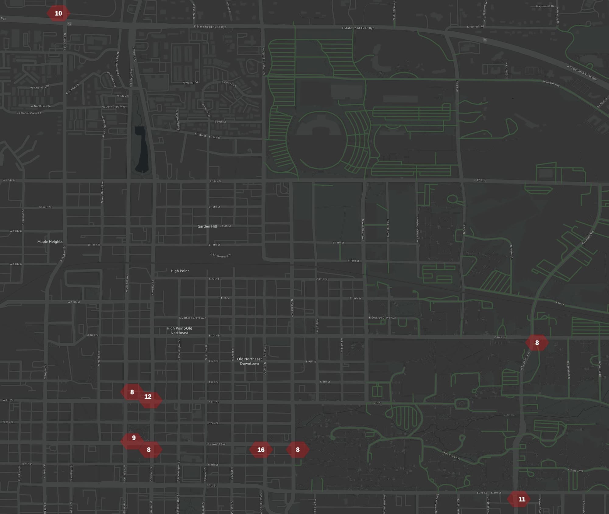
You can also filter by right-clicking on the hex layer and using a basic filter expression like: "total_crashes_per_hex_cell" > 7 Experiment with the cut-off number until you get the desired number of locations remaining. Here's the result. The styling for the layer is explained below.
Assigning crashes to closest intersection
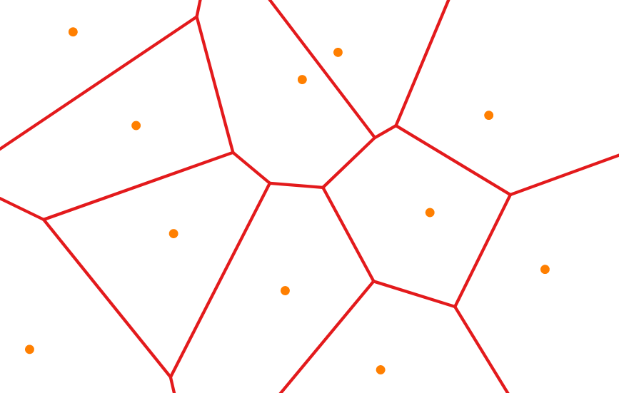
Using Voronoi polygons, every crash is assigned to the closest intersection.
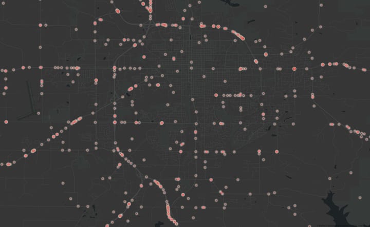
In the image below, you can imagine the dots are intersections. The Voronoi polygons cover the area so that all points of the plane closer to the center point than to any other.
To do this analysis, you'll need a layer with a point for every intersection you want to consider. Some public data portals offer this. Once you have a layer in QGIS with the intersection points ("Layer > Add Layer > Add Vector Layer") then you can go to "Vector > Geometry Tools > Voronoi Polygons" to generate the polygon layer for it.
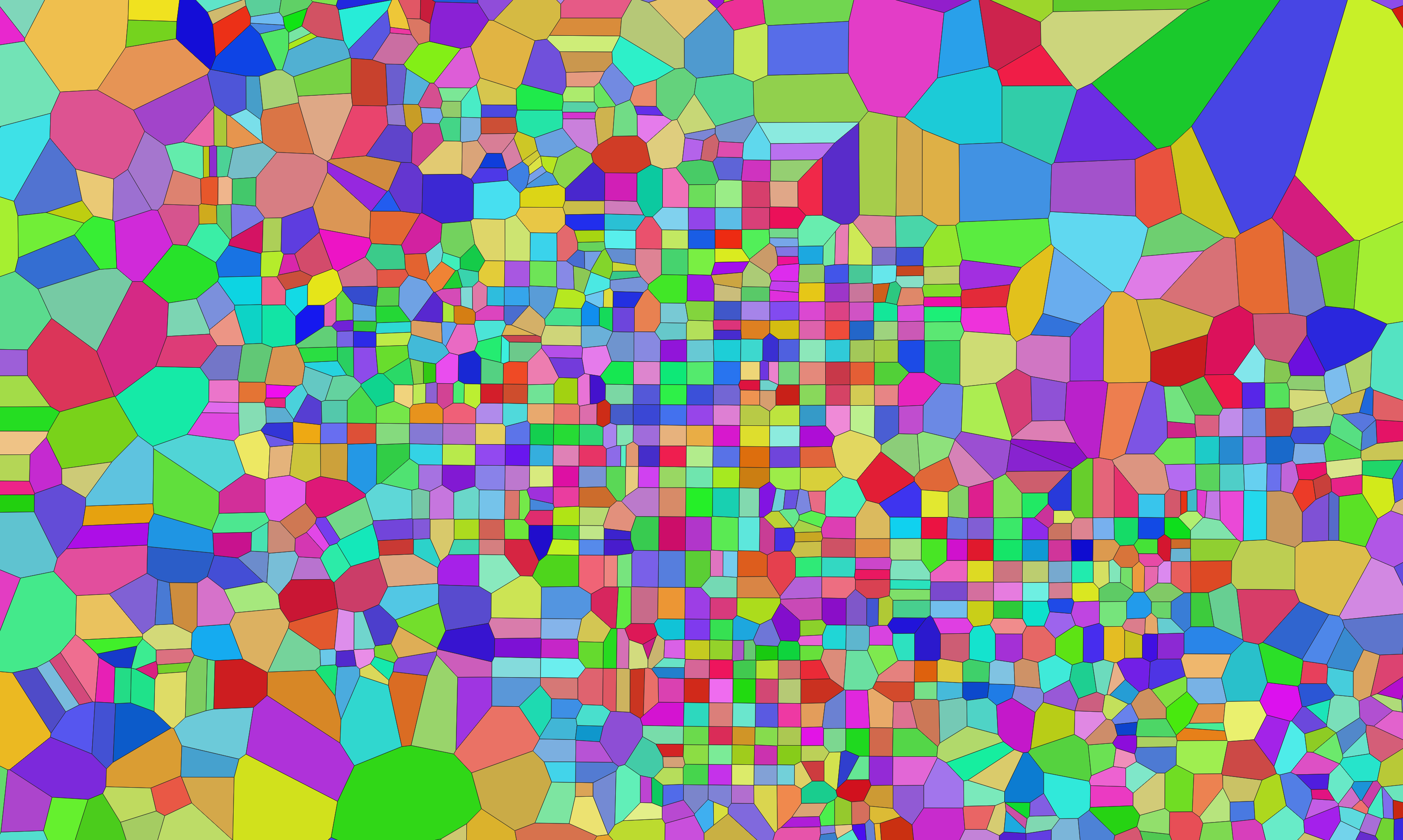
Imagine the image above representing polygons around intersection points. In the downtown area in the center, the polygons are smaller, where the street network is denser. In the upper right, the street network is relatively sparse so the polygons are larger.
Once you have the polygons, counting the crashes within them uses the same method described above for hex cells– "Processing Toolbox > Points with Polygons".
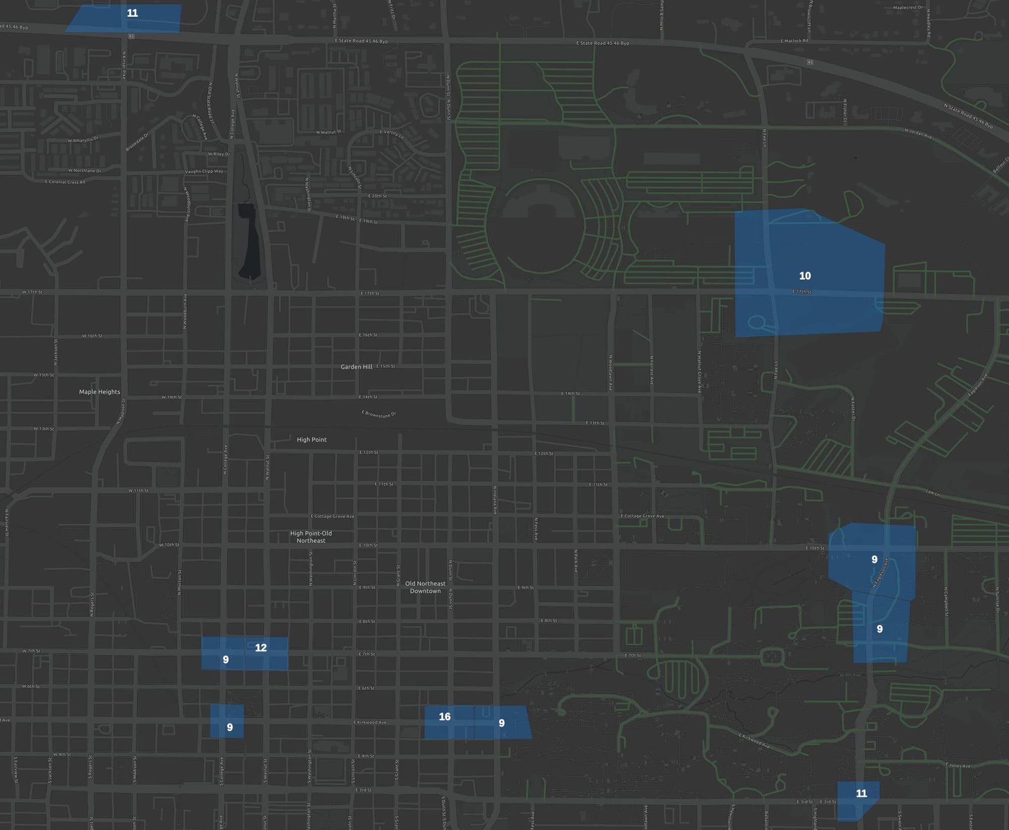
Crash analysis using radius from intersection
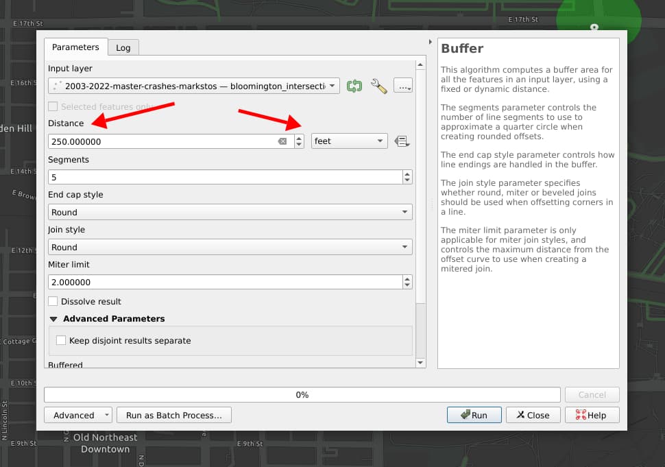
You'll need a layer of the intersection points for this one. The intersection layer will need to need to be in a local CRS projection. If you don't see an option later to specific your radius in feet, then your data is not in a local projection. You can right click on the layer, select "Export", and then during export set a local CRS, and try again with your re-projected layer.
The steps to find the "top" intersections once you have this polygon layer are the same as for the other methods above.
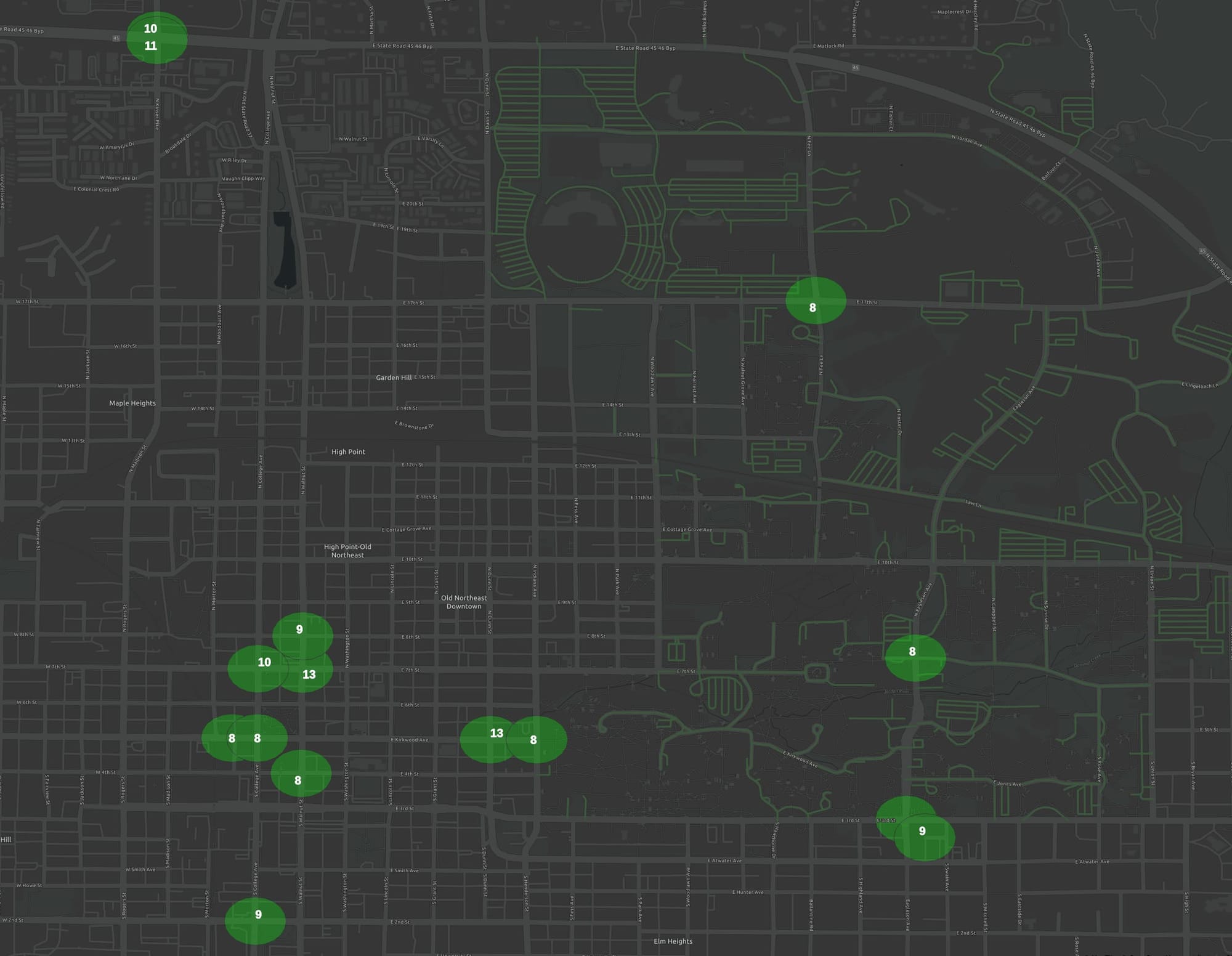
Crash analysis using radius-Voronoi method
This method considers crashes with 250-feet of an intersection with a radius analysis and then attributes the crash to the closest intersection using Voronoi polygons. Below we'll compare the results of the various methods. Here are the steps for this method:
- Starting with the layer of intersection points in a local CRS projection, using "Vector > Geoprocessing Tools... > Buffer" to create a new buffered-intersection layer that 250-foot radius buffer around each intersection.
- Use "Vector > Geoprocessing Tools... > Clip" to "clip" the crash layer using the buffered-intersection layer as an overlay, creating a "clipped crashes" layer.
- Use "Processing Toolbox > Voronoi Polygons" with the original intersections layer as input to create an "intersections Voronoi polygons" layer.
- Use "Processing Toolbox > Count Points in Polygons" with the "clipped crashes" points layer and the "intersections Voronoi polygons" layer. As with other methods above, you wish to select a field to weigh the crashes.
- Follow the steps to find the "top" intersections are the same as above.
- At this point, each Voronoi polygon will have the right number of crashes assigned to it, but visually doesn't illustrate that only the crashes within 250 feet of the intersection are considered. So one more step is used. Using "Processing Toolbox > Clip", select your final Voronoi polygon layer with the crash count as the one clip with the "Intersections buffered to 250 ft" as the overlay. Finally, you see the result visualized:
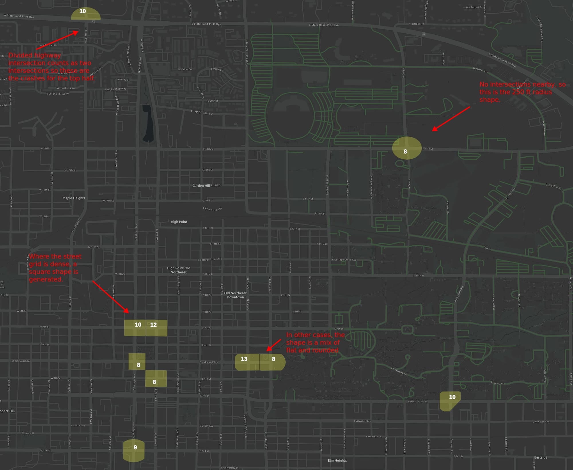
As intended, you get different polygon shapes depending on the intersection density. When intersections are sparse, you get the full 250-foot radius circle, as in the upper-left. For a divided highway, you may get half a circle at a top, as crashes at the split intersection are put into two buckets. Where the grid is adjacent to park, you might get one side squared and one-side rounded.
Is this a good model for a messy reality? I'll get into comparing the results methods below, but first let's go over how to style layers.
Styling crash analysis results in QGIS
No matter which approach you used, you can style them using the same methods because the result in all cases is a layer with a collection of polygons, where each polygon contains the number of crashes.
Here we'll make the polygons partially transparent so you can see some of the road network beneath them and add a count to each polygon of the number of crashes it contains.
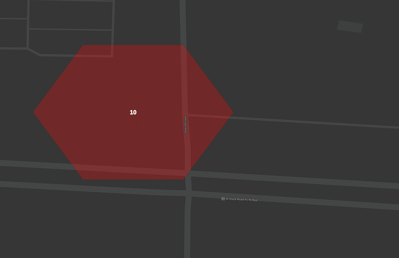
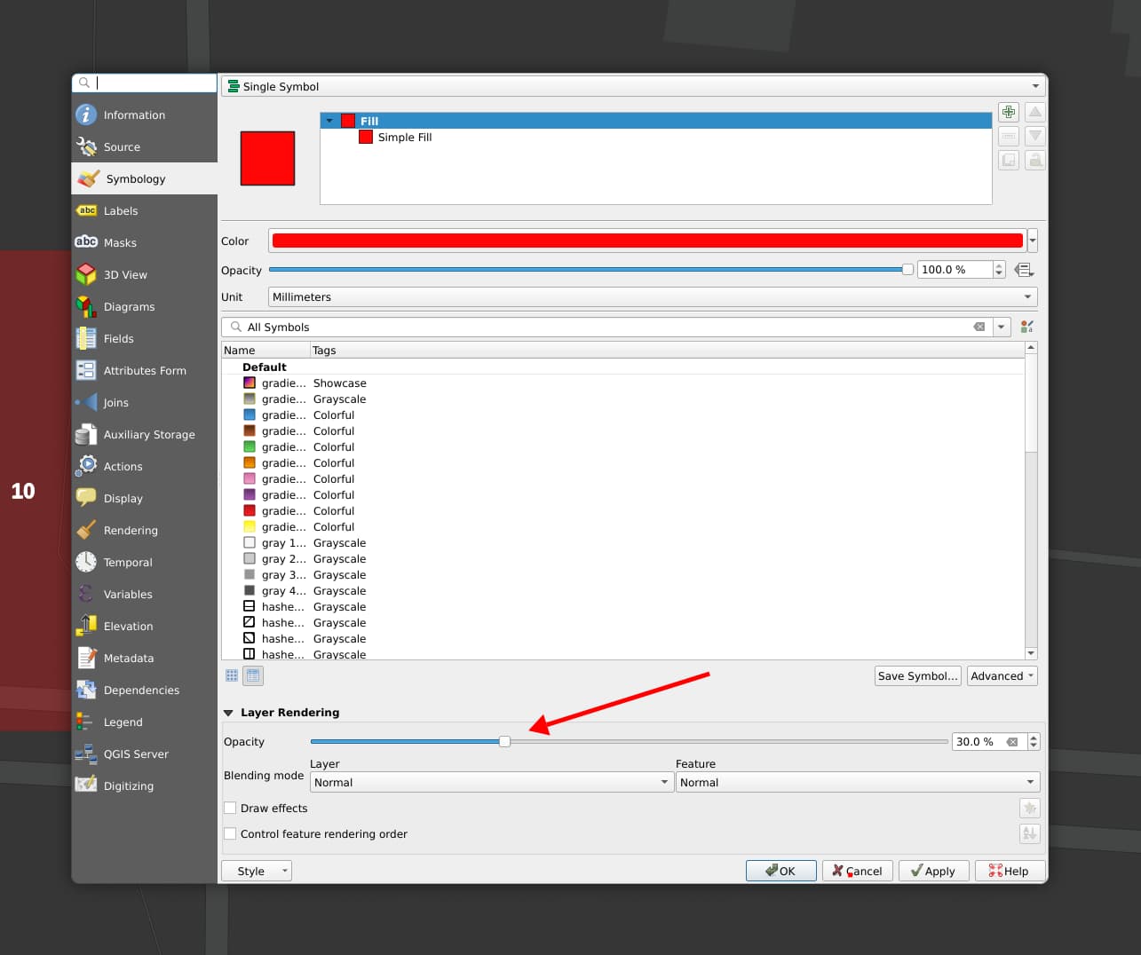
You can right click the layer and select "Properties > Symbology" to get the screen above where you can select the color and opacity if your polygons.
Adding the number of the crashes in each polygon is also done through Layer Properties, in the adjacent tab for "Labels".
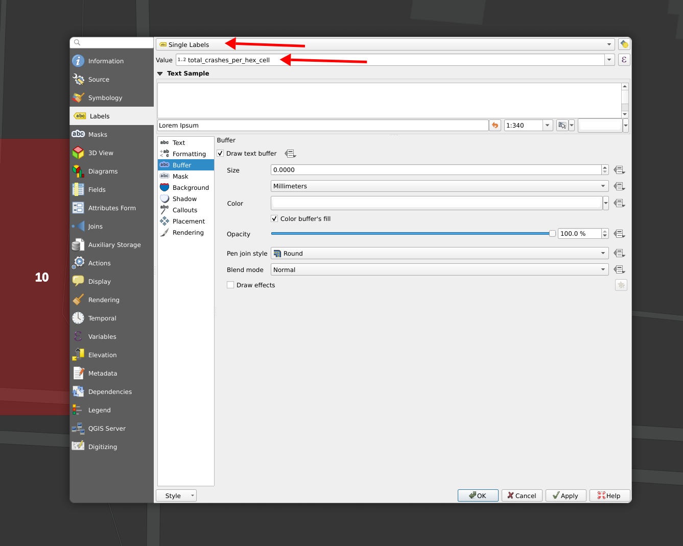
The key things here are to select "Single Labels" as the type of label and then use your column name as the value. As you start to type a column name, QGIS will offer to auto-complete the spelling for you.
Comparing heatmap, hex, radius, Voronoi and radius-Voronoi intersection crash analysis results
I've now looked at five different ways to analyze intersection crashes. Let's look at how the results compare.
Before I start: Something to keep in mind with all of these is that this is a relative small data set where a single data point is enough cause a different result in one method or another. Still, the results are useful for general comparisons.
Only about three layers can be comfortably visualized on a single map, so I'll use a series of maps to compare these.
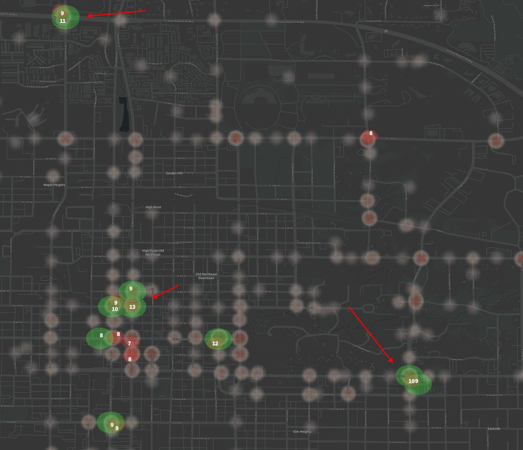
The hex method necessarily finds some additional intersections because it's not counting some areas twice. Notice that although the hex method doesn't specifically count crashes around intersection that all the hex cells that were top crash locations contained intersections. So although not all the hexes are centered on intersections, it did a good job of finding intersections with the most crashes. To get a fuller picture, we'll compare the hex method with the Voronoi methods.
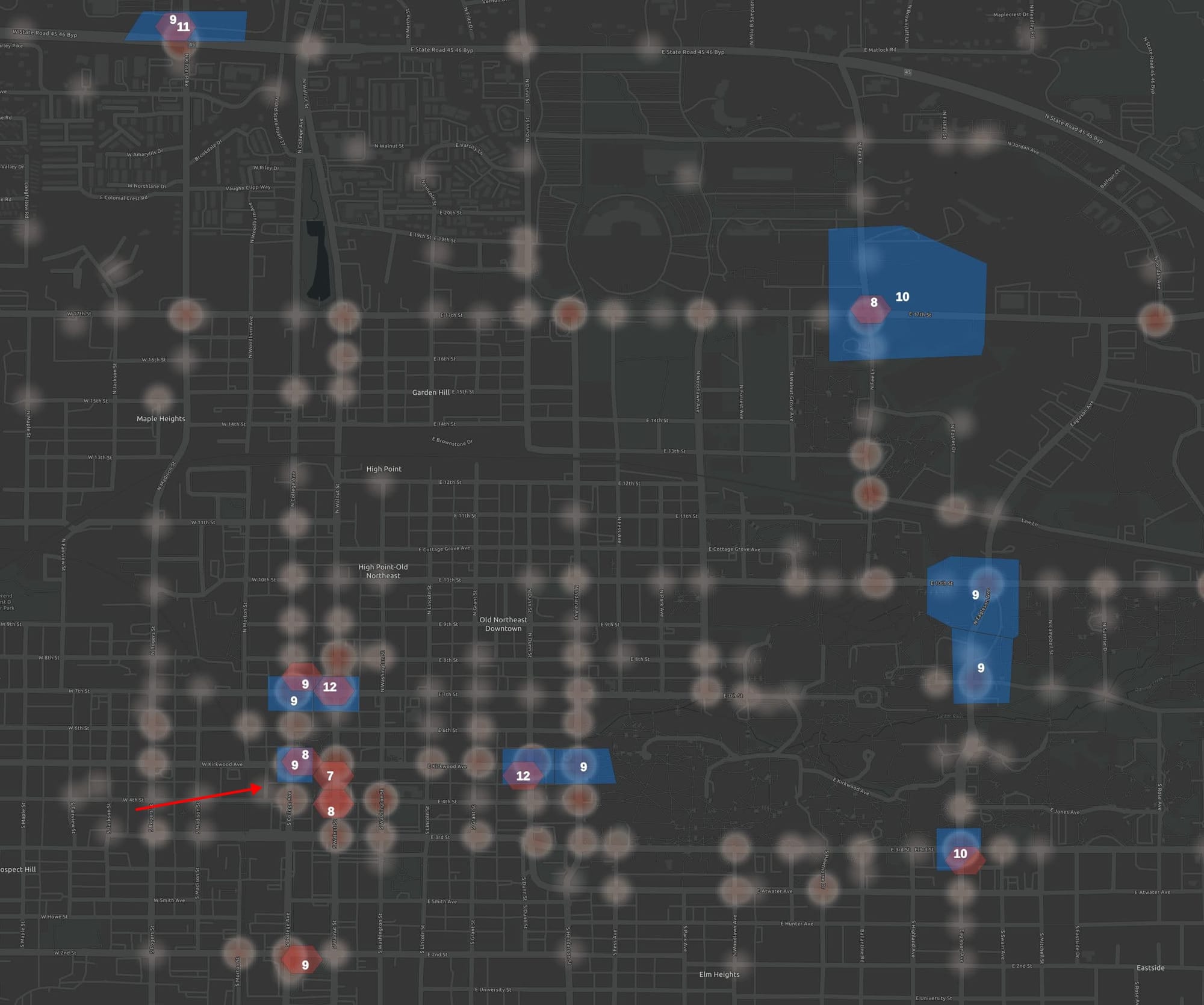
The most interesting thing about comparing the hex-binning method and the Voronoi polygon methods of finding top intersections is how much they agree despite how different their approaches are. They agree 7 out of 10 times. Here the red arrow highlights that where they disagree, the number of crashes differs by just one. This comparison would have perhaps been more interesting if I was looking at all crashes were differences were more pronounced. Also notice the relative huge blue Voronoi polygon in the upper-right. It has counted some crashes more than 250 ft from the intersection, perhaps skewing the results. As someone who is familiar with our street safety, both highlighting useful sets of intersections.
For the final comparison, we'll compare hex-binning with combining the radius and Voronoi methods. This will solve the double-counting problem with the radius method as well as the problem with counting crashes too far away with the Voronoi-polygon method.

When the hex-binning method is compared with a method combining radius and Voronoi-polygon analysis, they agree in almost every case. If a slightly larger hex grid size had been selected, it would have better matched the area of the Voronoi polygons and likely matched even more.
Overall, the radius-Voronoi polygon method is the best of the bunch. Unlike the hex grid, all counts are centered on intersections. Unlike the simple radius method, it does not double-count crashes. And unlike the simple Voronoi polygon method, it does not count crashes further than 250 ft away from intersections.
I consider the hex-bin method as the runner up. It closely matched the radius-Voronoi method while requiring fewer steps and not requiring an intersection layer as an additional input.
Did I miss something? Should I produce context like this in a video format? Leave a comment or use one of the contact options below.
Comments ()