How to Create a Heatmap of Sidewalk Location Priority
Your city has an incomplete sidewalk network. The budget to build new sidewalks is limited. Which sidewalks should prioritized to build next in a way that is objective, transparent and improves transportation equity?
Here's how to build to heatmap of locations to prioritize to build sidewalks, based on spatial analysis I did for the City of Bloomington, Indiana.
How should locations be prioritized for funding sidewalks?
The specifics will vary be location, but here's a starting point:
% Demand
+ % Safety
+ % Equity
----------------
100% Priority Score
What metrics indicate demand for sidewalks?
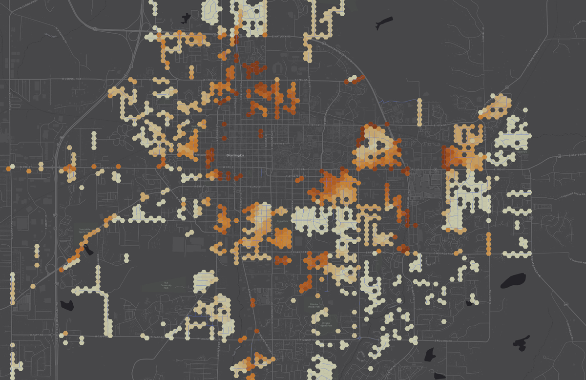
One of the best metrics for indicating demand for walking is Walk Potential. It's based on the 10-Minute Neighborhood concept of having a neighborhood with having many common destinations within walking distance. Here's a Walk Potential map of Bloomington, Indiana:
Other metrics that could indicate demand for sidewalks could be:
- Housing density or population density. Ideally, local metrics may available that more granular than census tract data, which is another source.
- Census data useful for considering sidewalk demand could be "Percentage of Car Ownership" and "Primary Commute Mode". Lower car ownership and a primary commute mode that is not driving could also indicate higher sidewalk demand.
- Proximity to Transit Stops. For example, locations within a 5 or 10 minute walk from a transit stop. What metrics indicate that sidewalks could improve safety in a particular location?
Desire paths are also an indicator of demand, but not available as a comprehensive metric. Using a Street View or site visits, desire paths can re-affirm demand for sidewalks.
Metrics that could indicate that sidewalks could improve safety at particular locations could include:
- Higher measured road speed
- Higher signed road speeds
- Wider road widths
- Historical crash data
- Higher traffic volumes. Available through Average Annual Miles Traveled (AADT) data
What equity metrics can be used to prioritize sidewalk locations?
Factoring in equity in sidewalk location priority compensates for under-prioritizing some groups historically, and also considers that some groups are vulnerable road users. For example, families that don't own a car rely on sidewalks to get around more.
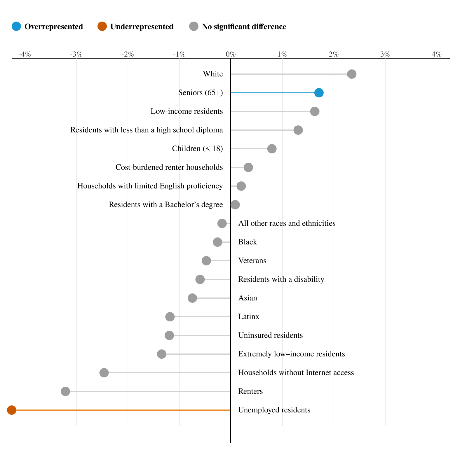
As a starting point, a city's existing sidewalk inventory data could be uploaded to the Spatial Equity Data Tool to see how the equity of the current system is skewed.
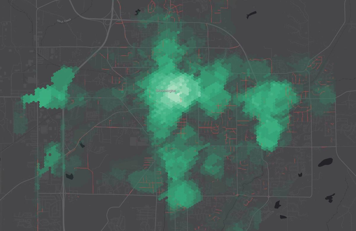
For example, I conducted a Sidewalk Equity Audit for Bloomington, Indiana that analyzed about 20 years of sidewalk funding in Bloomington Indiana. I was looking specifically at locations that were ultimately chosen by City Council, not objective metrics. Here's a report generated from the Spatial Equity Data Tool on those projects:
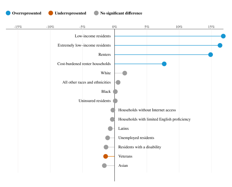
The same tool can be used to check out balanced a proposed system as well. For example, here's an analysis of the top 100 locations of projects selected with a criteria that favored sidewalk demand. The project prioritizes sidewalks areas with a higher percentage of low-income residents and renters.
The equity metrics used will likely come from census data. Examples include:
- % Residents Renters
- % Residents BIPOC
- % Median Income Score
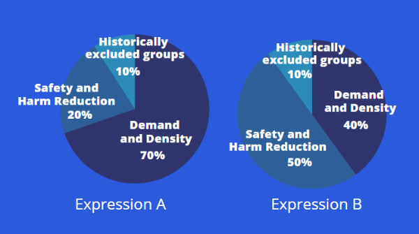
When Bloomington, Indiana was creating their final priority formula, they reviewed multiple options and compared them. Consider trying some options and see how they compare. Here are two that Bloomington used:
How to combine several variables to create a heatmap
There are two major steps to creating the priority heatmap
- Create a hex grid with metrics for each cell
- Visualize the hex grid
To help create the hex grid and metrics for each cell, I published the Sidewalk Priority Toolkit plugin for QGIS which implements a number of algorithms for this. It includes spatial analysis algorithms for the following:
- Creating an empty hex grid for a city
- Adding Census Data, both from local sources and from the Geocod.io API, using "Grid Priority (Point within Polygon)"
- Maximum AADT speeds for each cell, using "Grid Priority (Values from Intersecting Lines)".
- Maximum street width and signed speed for each cell, using same metric as above.
- Whether a cell is a traffic-calmed location, using "Grid Priority (Point Data)"
- Calculating Transit Potential score based on 5 and 10 minute walks to transit stops, using "Grid Priority (Proximity Test)".
- Length of missing sidewalk in the cell using "Grid Priority (Length of Intersecting Lines)".
- An algorithms for calculating Walk Potential is also included.
Visualizing a heatmap with several variables
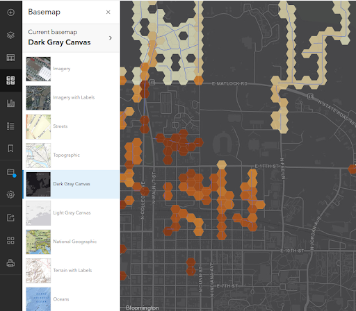
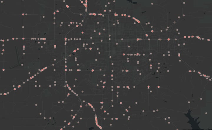
Once you've created a hex grid with several variables attached to each cell, it's time to visualize it on a map. Here I show examples using ArcGIS Online, but the same approach to filtering and styling would work in other tools as well.
Choosing a Basemap
Because heatmaps use a range colors, consider using a muted basemap like Dark Gray Canvas to keep the focus on the heatmap without making the appearance too complex.
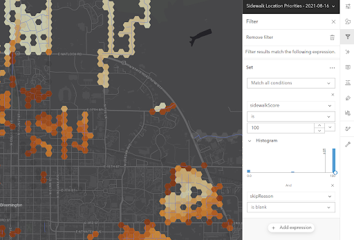
Filter out locations you don't want to show
Here, the hexes are being filtered to only show missing sidewalks. Also, if underlying data is has some known flaws, some hexes may need to be manually marked for exclusion before importing. So hexes with a “skipReason” are skipped, too.
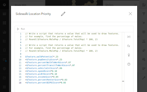
Style based on an expression
Select the Styles menu, then "Expressions"
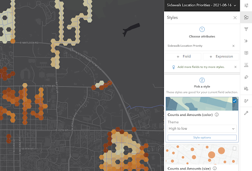
Use a combination of metrics that all have the same scale, like 1-100. Assign each metric a fractional weight, so the sum of the of the weights adds up to 1. Here, “walkPotential” was given a 25% weighting.
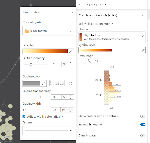
Fine tune the Theme and Symbol Style
Choose a gradient theme. Consider setting the fill transparency to about 30% to show a bit of the underlying map below the heatmap. Adjust the data range range sliders to highlight one of the range, or evenly distribute the gradient.
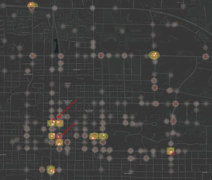
Example Sidewalk Priority Maps
The City of Bloomington, Indiana made several maps based on this approach that they used for planning. You see them here, in this scrollable embedded report.
Questions, feedback welcome
I can be contacted at mark@stosberg.com on Mastodon at @markstos@mastodon.online.
Comments ()